Make Lunchtime Team Building Easier
Many companies have team building through team lunches, where the entire team will order food delivery together. However, it is problematic for the person who organizes these meal: he or she has to track down everyone’s food preference and pre-order while everyone has a busy schedule to get a decision, which is very time- consuming.
Grubclub is the third party mobile App which allows the entire team to select their restaurant, lunchtime and dish preference, and to make the team- building through lunchtime without wasting time with ordering logistics.
To start my design, I listed the pain points of users in priority:
- Challenges to managing time to record everyone prefers.
- Challenges to make everyone in the team to have an agreement on restaurants and convenient timing.
- Challenges to review choices and orders and even last- minute changes.
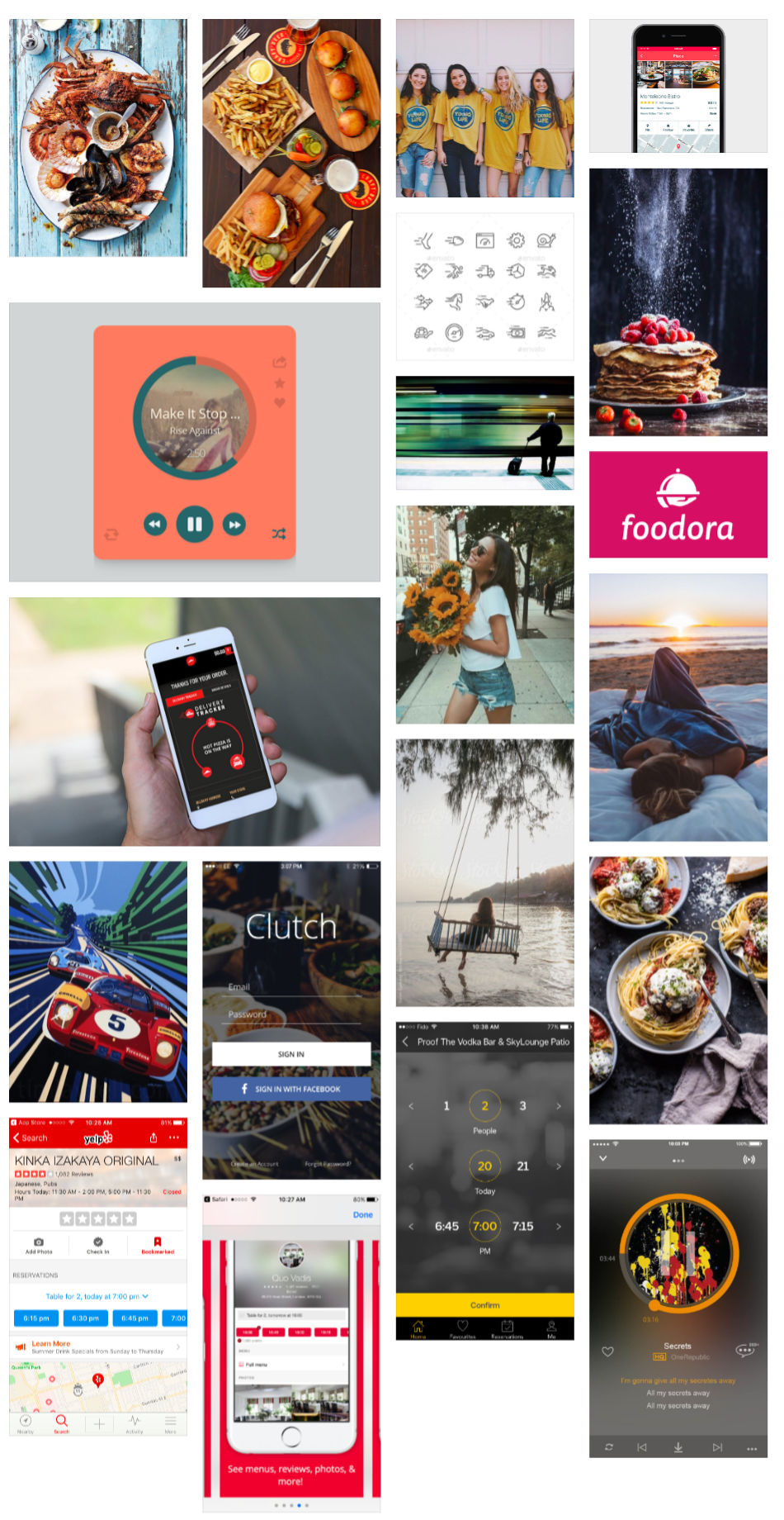
1. Mood board
Then I labeled the mood board with following feelings: easy, timesaving, outgoing, passionate, happy, creative, stylish, young professional, relax, appease appetite, organized, and quick.
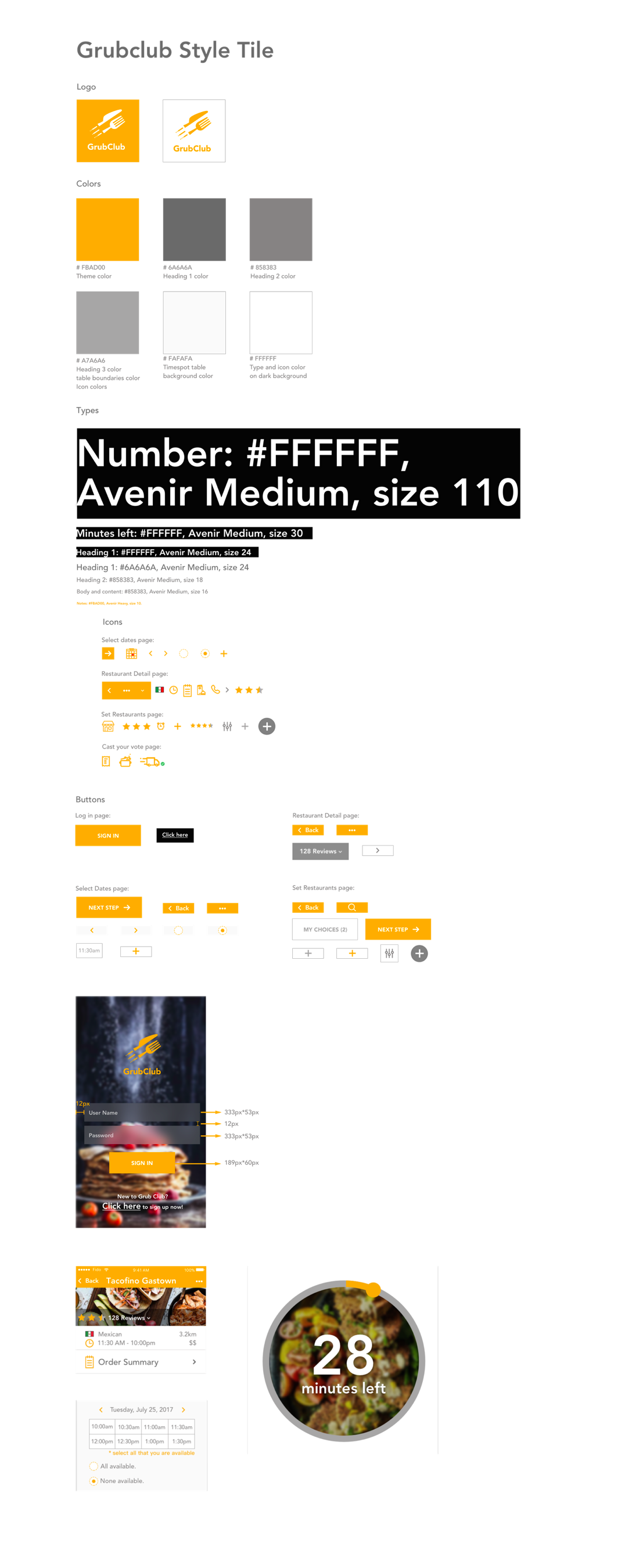
02. Visual languages
Based on the mood, I created the following visual languages for the Grubclub Mobile App.
Color: white, yellow, and grey
I researched into color and food psychology to make decisions on the colors for the app:
I choose white because of white means excess consumption and unsatisfaction when related to food. The food App should try to encourage people to order as much food as possible.
Yellow is the brand color I choose because it would appease appetite and make people feel relax and happy.
Grey is a neutral color which fit with other colors. Also, the gradient of grey also means a different degree of importance.
Space
I designed the layout of the App from left to right because it follows human’s reading habits. Also, I want the space of the design to be organized, simple, large picture size, and with clickable space.
Shape
I used circles for restaurant photo, and tracking timing used ring shape. I also designed rectangles as shapes for the logo, input bar, buttons, time spots, photos, and choices
Movement
Regarding movement, I use the circular shape for tracking time and moving along with time passing.
03. Style Tile
04. Problems and solutions
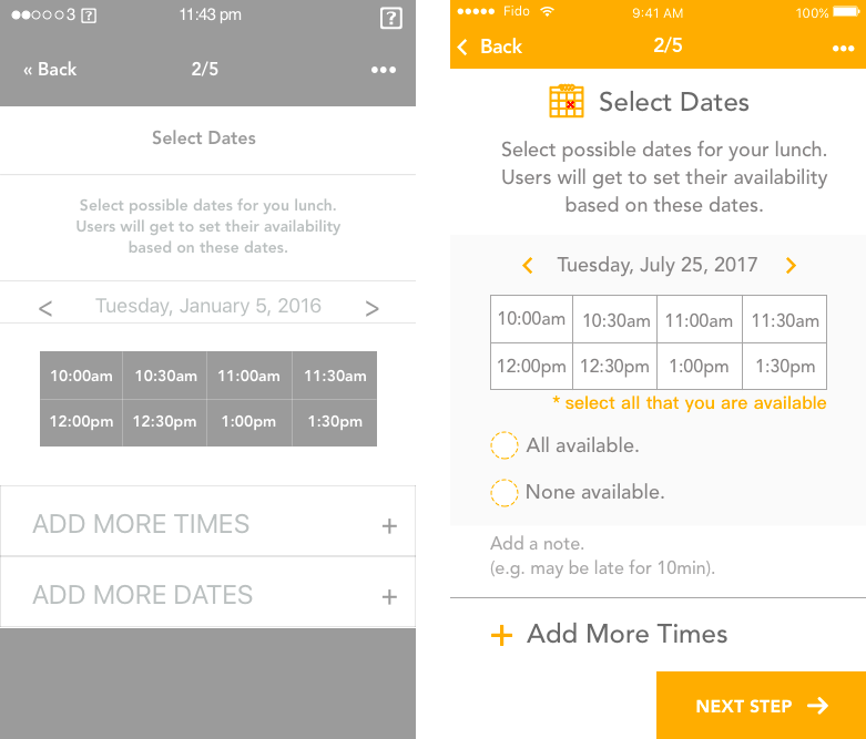
Select date page
When I got the mid- fidelity wireframe, I feel the features have not optimized enough for the users. I think it would be time-consuming for the user to click all or none of the time spots one- by- one, so I added choices for one tap to select all or none. Also, I add an option for adding notes for people who have uncertainties about lunch pickup or time reschedule.
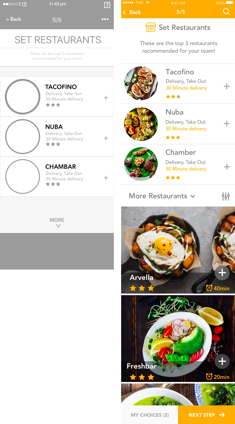
Select restaurant page
For the select restaurant page, I replaced “more” icon with search icon to navigate users to search particular restaurant they want. Besides, I added “More Restaurant” section with filters to provide more options for the users.
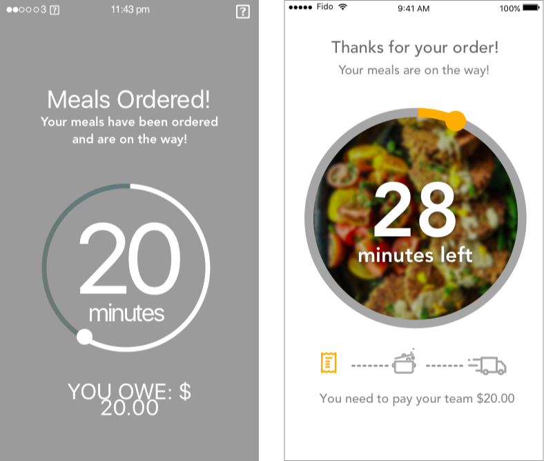
Cast your vote page
In addition to the original mid- fidelity wireframe, I added icons to represent steps after casting a vote. It would make users have more control over the process and feeling less anxious while waiting for the delivery. Also, I think the tone of “you owe 20 dollars” sounds unfriendly, so I replace it with “ you need to pay your team $20.00”.
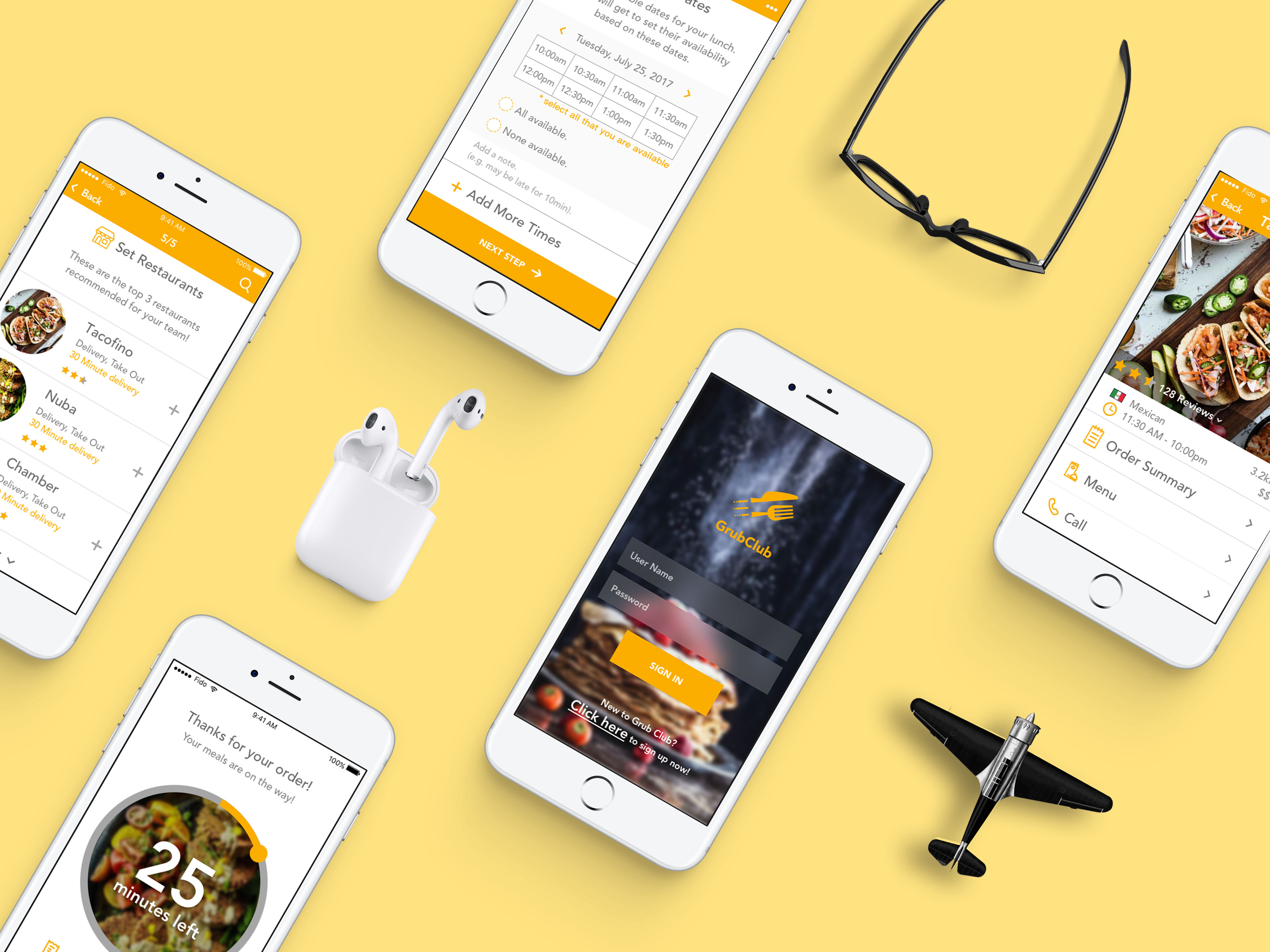
05. Prototype
Feel free to browse the prototype. Cheers!
To sum up, this is the second individual UI project at Red Academy. I not only designed visual elements based on provided wireframes but also optimized features while standing in the user’s shoes. During the presentation, instructors are glad about my progress in enhancing user interface and user experience, and my classmates provided positive responses since the App looks consistent, and the pain points for the users were resolved.
© 2019 Lucy Wu- UI/UX Designer. All Rights Reserved.
© 2019 Lucy Wu- UI/UX Designer. All Rights Reserved.
© 2019 Lucy Wu- UI/UX Designer. All Rights Reserved.
